The level of creativity at FIE Frankfurt this year was at an all-time high – here are our top 5 exhibition stands and why…
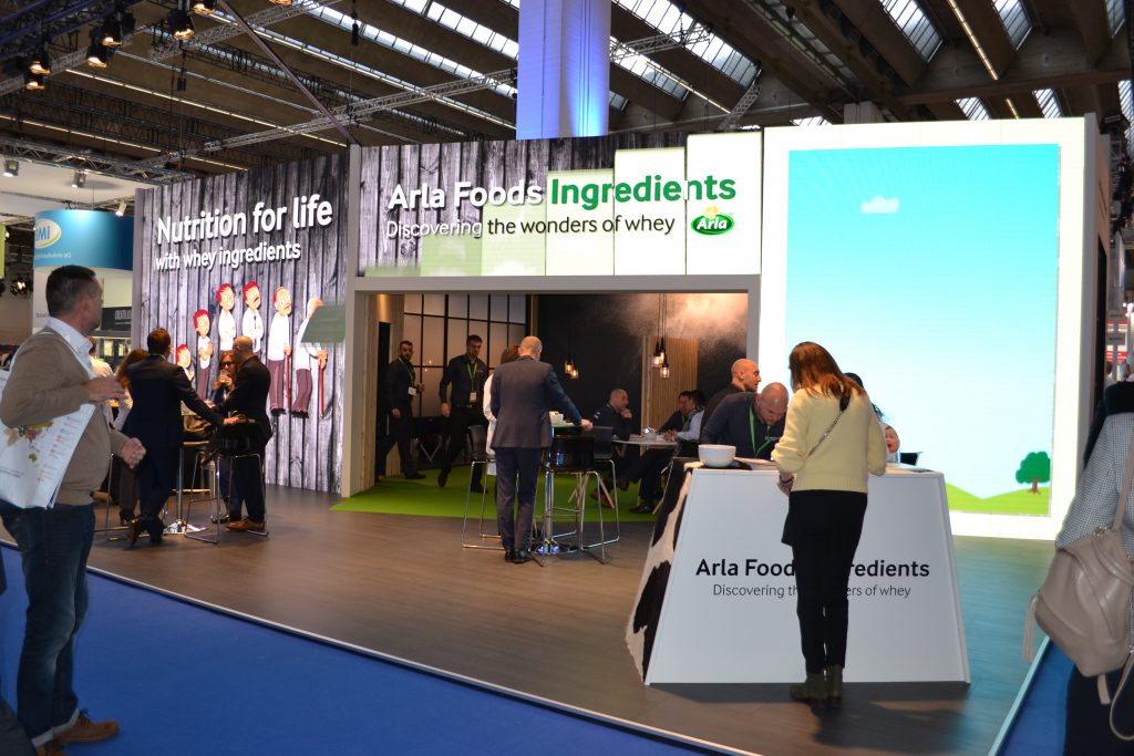
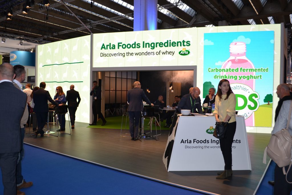
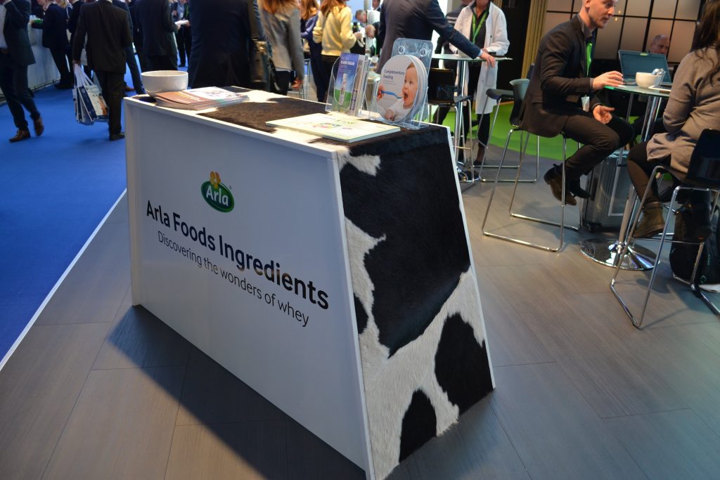
A giant digital screen lends a great canvas for the Arla messaging – you couldn’t ignore this stand. We love the texture on the table.
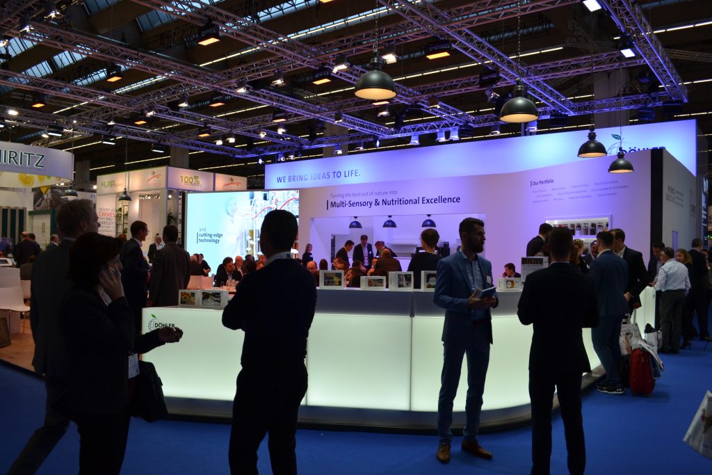
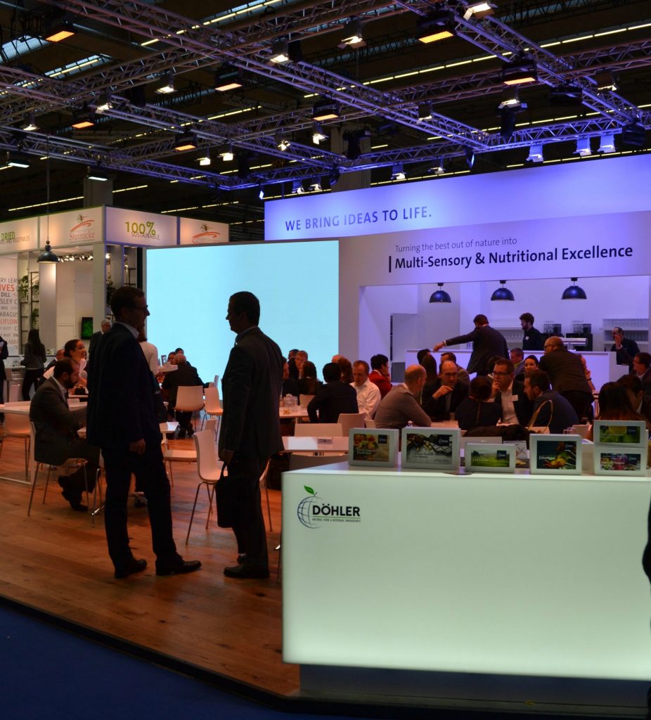
2. Dohler
A great execution here using beautifully soft light panels – which ties in perfectly with their positioning. A really inviting, lowkey, yet effective, space.
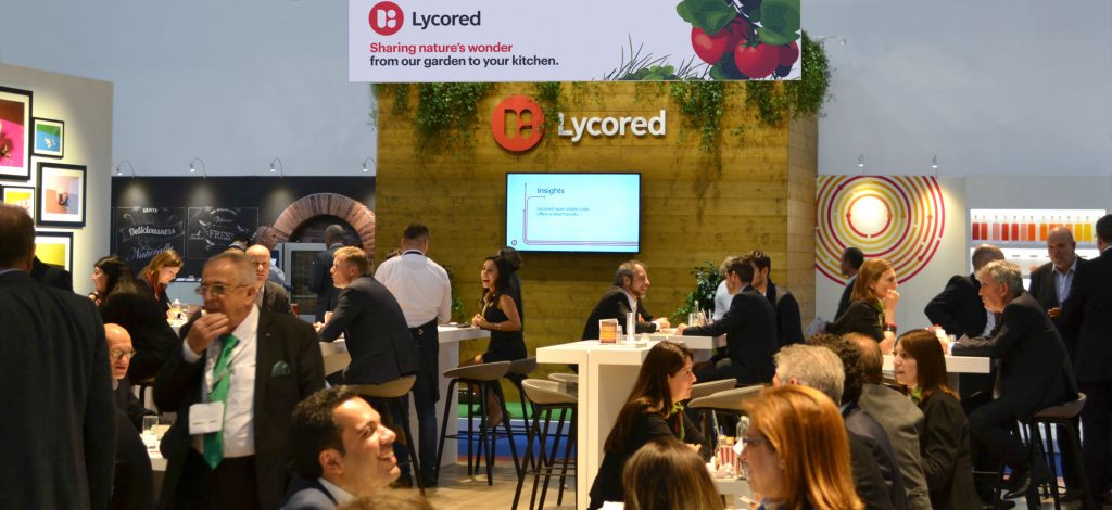
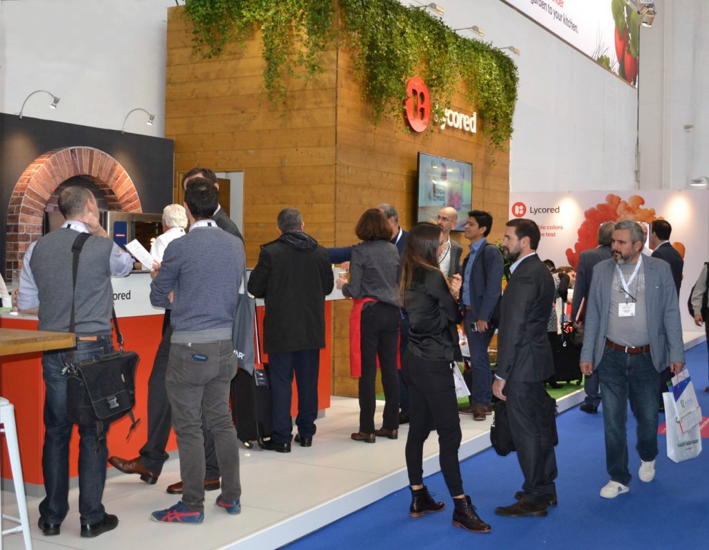
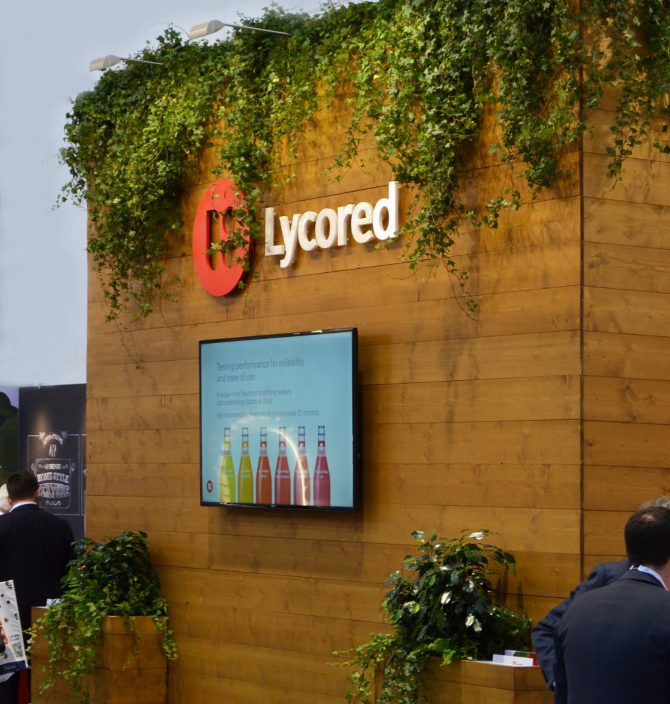
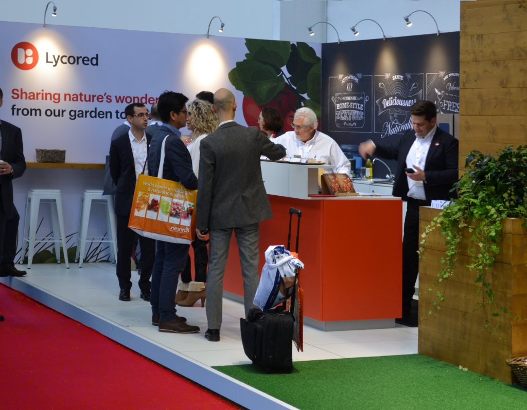
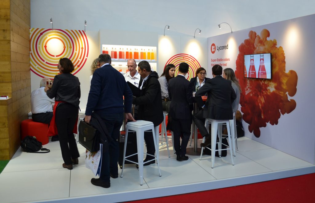
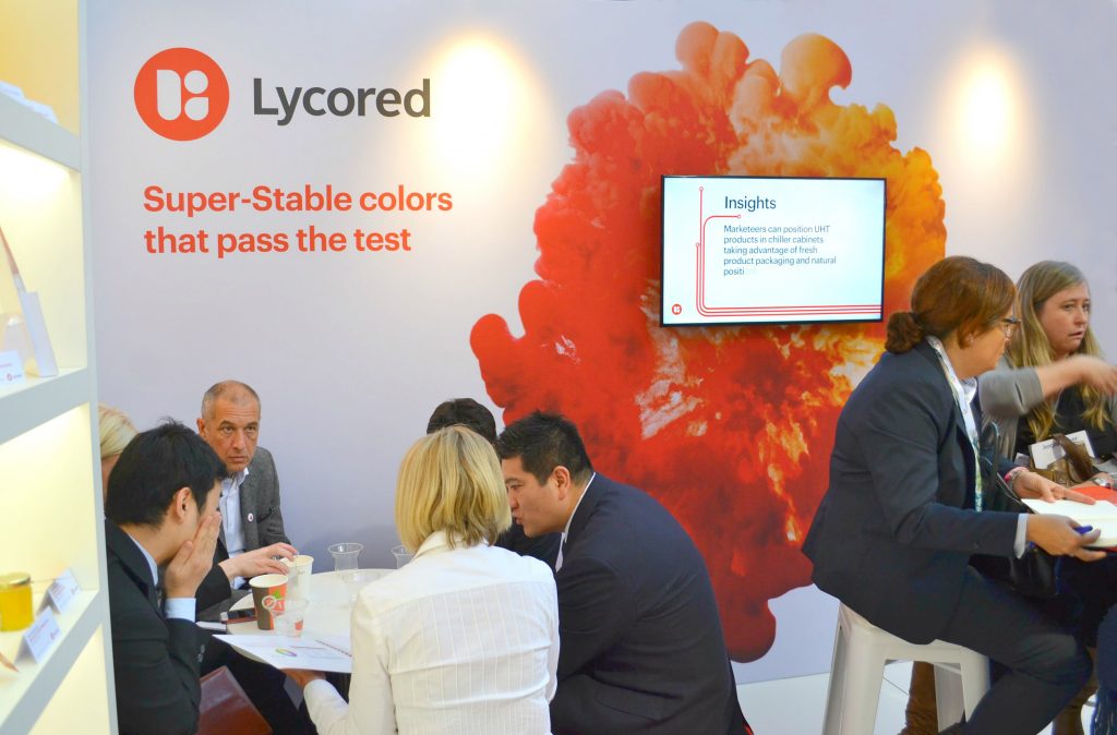
3. Lycored
Call us biased, but the Lycored stand this year looked incredible, with strong visuals, bright displays, digital screens and pizza (what’s not to love about pizza?).
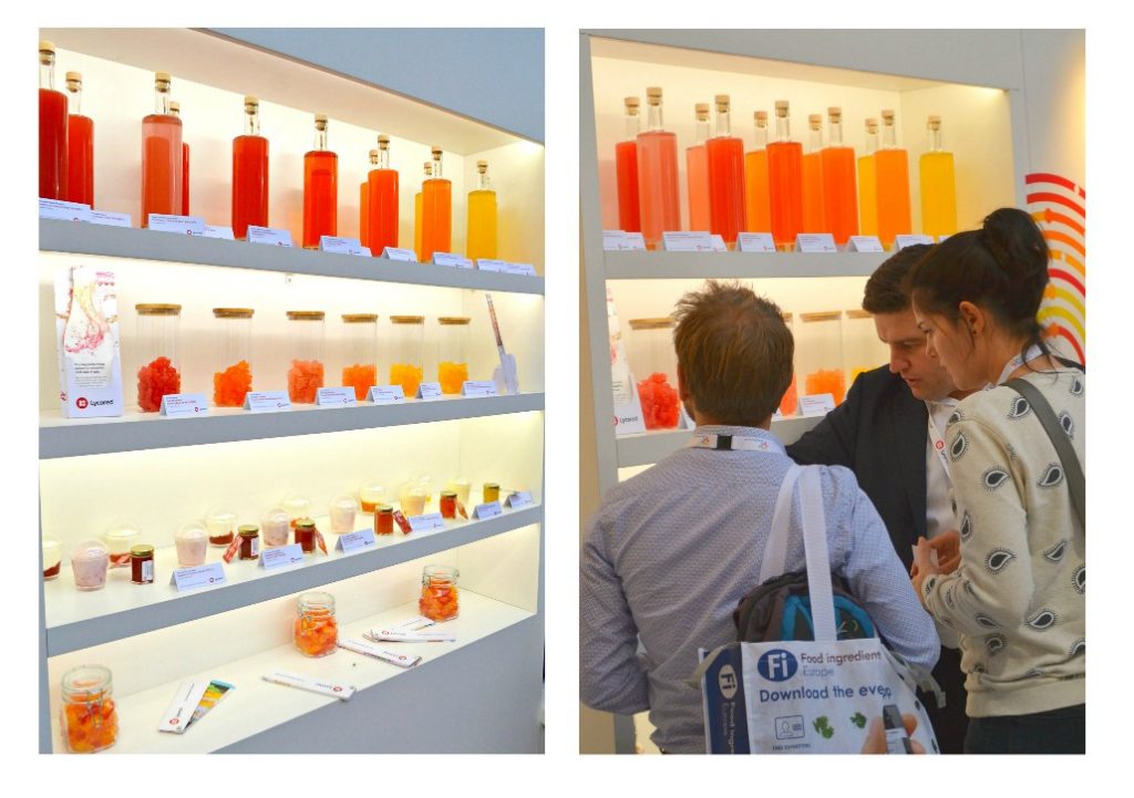
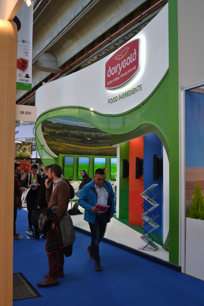
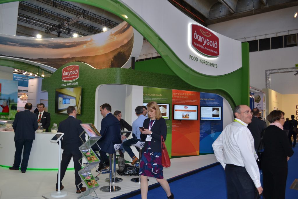
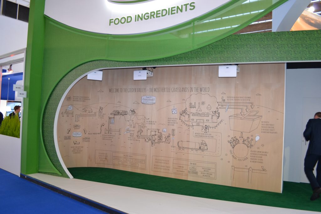
4. Dairygold – Beautifully impactful, strong imagery and it featured a nicely produced interactive wall – see video below. Not the first time we’ve seen something like that, but really effective nonetheless.
3. Cargill
This stand really creates an impact with its colour, height and creativity – and an eye-catching digital A-Frame sign too. They have been using this Sustain Tree concept for 3 years now, but it still impresses.
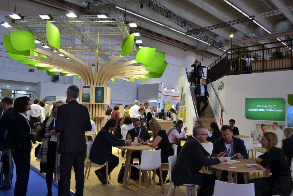
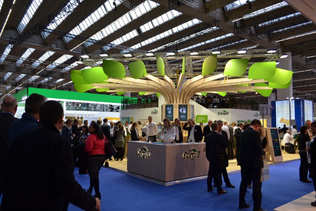
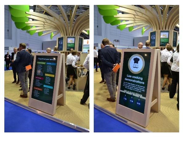
Congratulations to every brand who created an impact at FIE Frankfurt this year!
If you’d like to get some thoughts and ideas on how to make your next exhibition your best yet, get in touch – we’d love to chat!

