Bespoke & Co is a company on a mission. They are passionate about the presentation of art (used in its broadest term) and its impact on work and living spaces. Like many specialist owner-managed companies, their business had evolved organically over time, growing fruitfully in unexpected directions. What had once been a niche supplier of raw materials and equipment to picture framers, now counts artists, photographers, interior designers, animation studios and festival organisers amongst its client base. While this level of diversity is all well and good from a business point of view, it really complicates effective communications and marketing. They came to Threesixty to help remove this complication and develop a comms strategy and website that would support its ambition to shake up the industry in Ireland.
“Working with Threesixty has helped us understand who we are and most importantly, who we are for. They probed and challenged us until we achieved clarity, and from there the messaging, visuals and website development fell into place intuitively. We love the positive response our website generates from our customers, partners and collaborators.”
The Challenge
The challenge that Jamie and the Bespoke & Co team presented to us was this. Can you take a business that has many strands, and deals with many customers, some of whom might traditionally be seen to conflict, and turn it into a simple story that we can proactively market digitally without tying ourselves up in knots in the telling? Oh and also, make it look beautiful!
“The unstated benefit of working with Threesixty is insight and clarity – it’s not always easy, but what sits behind the style is substantive, and that will stand the test of time.”
Aidan Roycroft, Studio Manager, Bespoke & Co
Approach
We brought Bespoke & Co through a hybrid brand development/web development process.
Discover some inner truths
The discovery phase was introspective by nature, we gleaned some learnings from Google Analytics and SEO tools – but the big insights came from two key workshops where we mapped the market and looked at the value created for each key of the customer groups. The progress wasn’t linear, at least twice in the process, we had to backtrack to fix our thinking before progressing. The end result was clarity around who Bespoke & Co is talking to, what characteristics unite them, and how they can help them.
Let’s get our words right
The first significant project breakthrough came about by challenging the industry language that we take for granted, we broke the three customers groups down into three key groups
- Frame Makers – those who frame for others,
- Art Makers – such as professional artists and photography studios who create art, and finally,
- Place Makers – interior designers, architects and developers who create environments for people to live and work.
The simplicity of this solution helped the project team focus more on the commonalities than the differences – and find the messages that unite them.
Bespoke & Co as a creative business
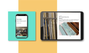
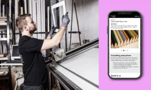
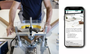
Another critical insight from the discovery phase was that it was important for Bespoke & Co to reflect their creative culture. So when it came to website design we were given carte blanche to push the envelope. To the horror of our SEO expert, we designed a solution that used very few pages, with very short-form content but very captured the creative spirit of the company – backed with very clear content. This was truly a case of the less said, the better.
Swipe or scroll – the unexpected challenge of different
Our development team took the wireframes and as ever did all of their good work getting the prototype together – interestingly once you stray from the beaten path on website design, in this case, horizontal rather than vertical scrolling, getting cross-platform / browser correct takes much more effort.
Pulling it all together
The final part of the project was to develop all of the written and visual content on the website. For written content, we kept the tone of voice clear but with character, we emphasised Bespoke & Co’s openness to conversation. So rather than drop downloads in as lead generation – every page led to an invitation to talk. With the creative, we were able to use both video and still photography, again this helped us keep the word count to a minimum.
Project Outcomes
- Absolute clarity for the business on its offer and the value created for different customers
- A suite of messaging for use in online and offline conversations
- A visual identity system that reflects the creative culture of Bespoke & Co’s business
- Strong website platform to build digital marketing campaigns
- A sense of pride in their website as an extension of their workshops and showrooms
“I loved the fact that we were quite fearless in the project, nothing was left unchallenged and Bespoke & Co gave us the freedom to explore new ways to do things and to dig deeper for fresh insights – the end result speaks to this depth and creativity.”
Simon O’Dwyer, Brand Lead, Threesixty
