The Client
Abbott’s Established Pharmaceuticals Division (EPD) is focused on helping people live healthier lives by bringing the benefits of trusted, affordable medicine to people in fast-growing emerging markets. Every day, more than 14 million people around the world use their medicines to live the best life they can through good health. They are the only multinational company where their pharmaceutical business is 100% focused in emerging markets.
Their Challenge
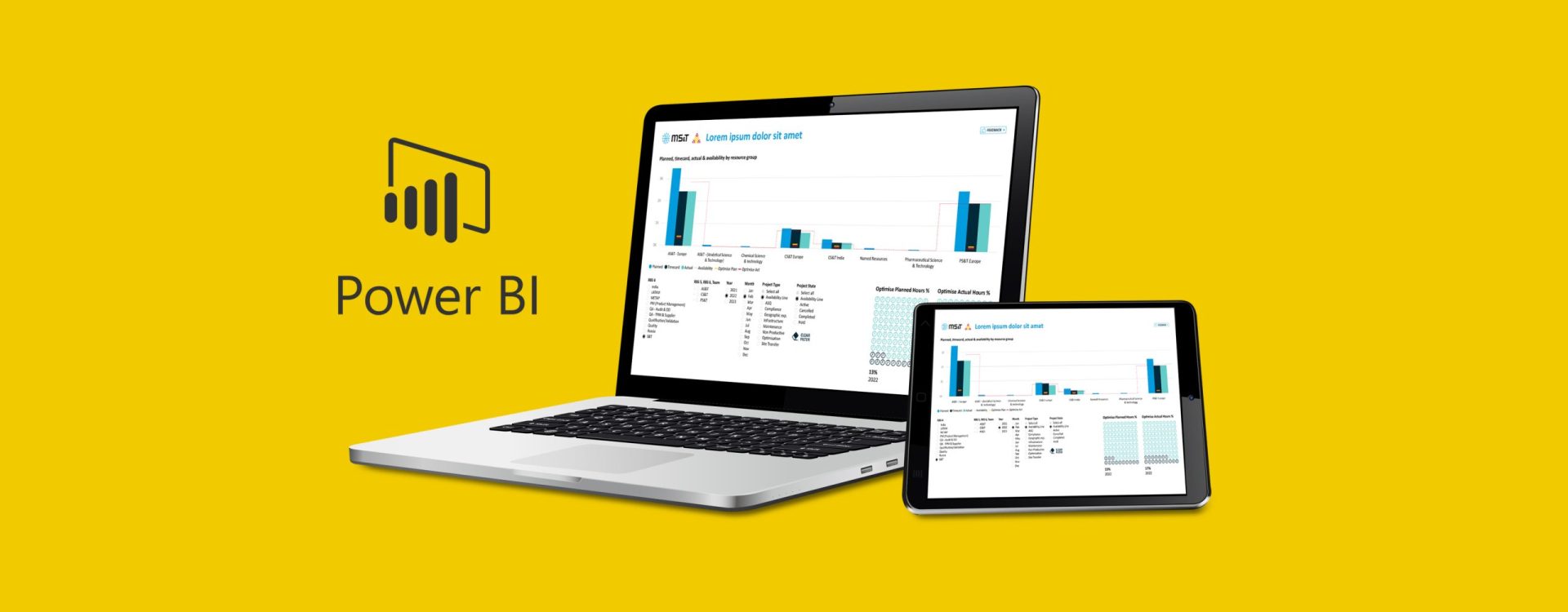
Abbott EPD has extensive Power BI capability within the organisation but needed to create design enhancements that would allow the reports it generated to be easily interpreted ‘at a glance’.
They approached Threesixty to help them with the visual design of the Power BI reports they generated within their Knowledge Management function by creating:
- A shared look and feel across all reports.
- Clear placement of navigation elements for slicing and dicing data.
- Reports with visually attractive information blocks.
From our side, the goal was to create on-brand dashboards with easily digestible sections that would enable better decision-making quickly.

Our solution
We kicked off the project with an online workshop to gain insight into EPD’s practices and use of Power BI. This allowed us to design a bespoke solution for the team.
We took our existing knowledge of elevated design for PowerPoint and combined it with effective techniques for data visualisation to create self-explanatory and easy-to-use dashboards and graphics.
These resulting design templates meant readers of the Power BI reports could jump straight into the data and navigate the information in a familiar, branded interface.
Our hope is that the report styling can be applied across the organisation and the new design format will become the norm of future reporting.


